Have you ever wondered what the IPL team logos stand for? Discover the hidden meanings behind the logos of your favourite IPL teams. In the Indian Premier League (IPL), team logos play a significant role in defining the team’s brand image and identity.
A well-crafted logo can make a lasting impression on the viewers’ minds and helps in distinguishing one team from another. In this article, we will take a look at the IPL team logos that have left a lasting impression on the fans.
1. Chennai Super Kings
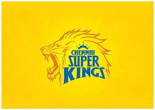
Chennai Super Kings’ logo features a roaring lion in gold and blue colours, with the team’s name inscribed in bold letters.
The lion represents the team’s fierce spirit, while the blue and gold colours signify confidence and royalty. This logo has become synonymous with the team’s success and loyal fan base.
2. Mumbai Indians

Mumbai Indians’ logo is inspired by the Sudarshan Chakra, a weapon of Lord Vishnu, with the team’s name written in bold blue letters.
The logo’s design reflects the team’s fighting spirit, strength, and agility. The blue colour symbolizes the calmness and stability of the team, while the golden hues depict the team’s victories.
3. Kolkata Knight Riders
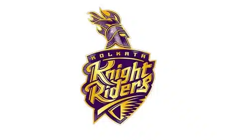
Kolkata Knight Riders’ logo features a knight with a helmet, holding a sword and a shield with the team’s initials inscribed on it.
The team’s name is also written in bold letters. The purple and gold colours represent the team’s passion and royalty, respectively. The logo perfectly captures the team’s brave and fighting spirit.
4. Sunrisers Hyderabad

Sunrisers Hyderabad IPL Team logos’ depicts an eagle in orange and red colours, with the team’s name written in bold letters.
The eagle represents the team’s sharpness and precision, while the orange and red colours symbolize the team’s energy and power.
The logo has a modern and sleek design, which perfectly reflects the team’s young and dynamic spirit.
5. Royal Challengers Bangalore
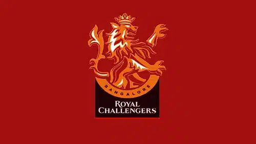
Royal Challengers Bangalore IPL Team logos’ features a lion in red and black colours, with the team’s name written in bold letters.
The lion represents the team’s courage and strength, while the red and black colours symbolize passion and energy. The logo perfectly captures the team’s aggressive and fearless spirit.
6. Rajasthan Royals
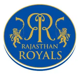
Rajasthan Royals‘ logo features a royal emblem with the team’s name inscribed in bold letters. The emblem has a traditional design, with a blue background and golden borders.
The blue colour represents the team’s calmness and stability, while the golden hues depict the team’s victories. The logo has a classic and elegant design, which perfectly reflects the team’s regal spirit.
7. Delhi Capitals
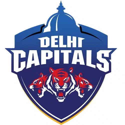
Delhi Capitals’ logo features a lion with a crown, holding a cricket ball in its paw. The team’s name is written in bold letters above the lion.
The blue and red colours symbolize the team’s calmness and energy, respectively. The logo perfectly captures the team’s fighting spirit and ambition.
8. Punjab Kings
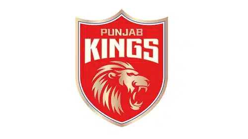
Punjab Kings’ IPL Team logos’ features a lion in red and silver colours, with the team’s name written in bold letters.
The lion represents the team’s courage and strength, while the red and silver colours symbolize passion and elegance.
The logo has a modern and sleek design, which perfectly reflects the team’s dynamic and ambitious spirit.
9. Gujarat Titans

The Gujarat Titans made their debut last season and won the trophy under the captaincy of Hardik Pandya. The team unveiled their logo in the metaverse last year.
The logo is inspired by the shape of a kite that flies high in the sky. Kite-flying is an integral part of Gujarat’s cultural heritage, with festivities like Uttarayan when International Kite Festival is celebrated in Gujarat.
The logo also has a lightning bolt just below the name of the team. The colours used on the logo, navy blue, gold, and white, are also used in the jersey.
10. Lucknow Super Giants

The logo of the Lucknow Super Giants contains a bat in the middle with a ball engraved in the centre of the bat. The bat has wings on both sides, and the Indian Tricolour has been used as an inspiration for the colour of the wings.
The design of the wings has been inspired by the mythical bird Garuda, which has the ability to fly quickly. The bat in the middle is blue in colour, while the colour of the ball is red with an orange seam.
The design of the ball resembles the auspicious ‘jay tilak,’ which is associated with good luck in Indian homes. The tri-colour in the wings has been used to represent the franchise’s Pan-India appeal.
The logo has been heavily inspired by Indian mythology. The logo has been carefully designed, and each element carries significant meaning.
Honourable Mentions
Apart from the top 10 IPL team logos, there are a few logos that deserve honourable mentions:
1. Deccan Chargers
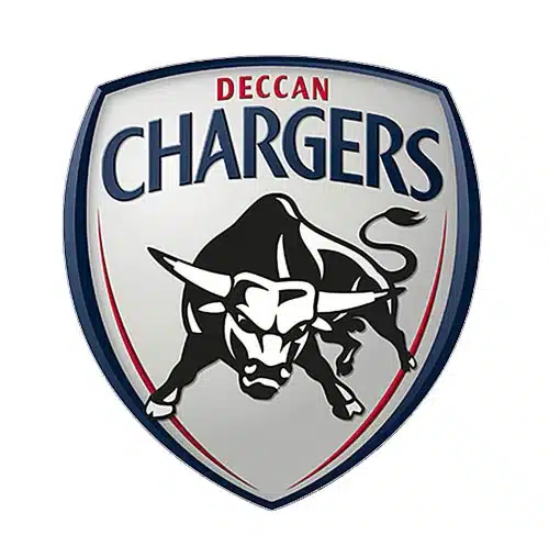
Deccan Chargers’ logo featured a charging bull in white and blue colours, with the team’s name written in bold letters. The logo perfectly captured the team’s energy and fighting spirit.
2. Pune Warriors India

Pune Warriors India’s logo featured a warrior with a spear in hand and riding on a horse wearing a helmet, with the team’s name inscribed in bold letters. The logo had a modern and sleek design, and the tricolour was used with chakra embedded in the name, which perfectly reflected the team’s youthful and ambitious spirit.
3. Kochi Tuskers Kerala

Kochi Tuskers Kerala IPL Team logos’ featured the tusks of an elephant, with the team’s name written in bold letters. The logo had a unique and vibrant design, which perfectly reflected the team’s dynamic and spirited nature.
4. Gujarat Lions
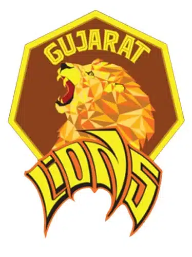
Gujarat Lions IPL Team logos’ features a lion in orange and yellow colours, with the team’s name inscribed in bold letters. The lion represents the team’s courage and strength, while the orange and yellow colours symbolize energy and purity. The logo has a modern and sleek design, which perfectly reflects the team’s youthful and dynamic spirit.
5. Rising Pune Supergiants
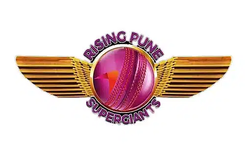
Rising Pune Supergiants’ logo features a ball in the centre and wings on both sides, with the team’s name written in bold letters around it. The logo has a unique and modern design, which perfectly reflects the team’s innovative and progressive spirit. The purple and gold colours represent the team’s stability and success, respectively.
Frequently Asked Questions about IPL Team Logos
Q 1: Which IPL team has the best logo?
A: There is no definitive answer to this question since beauty is subjective, and people have different preferences. However, many cricket enthusiasts consider the Mumbai Indians and Chennai Super Kings logos to be among the best.
Q 2: Who is the symbol of the IPL logo?
A: The IPL logo features a cricket player, who is in a batting stance and ready to hit the ball. The logo also includes the text “IPL” in bold letters, with the player’s silhouette standing in place of the letter “I.”
Q 3: What is the animal of the RCB logo?
A: The Royal Challengers Bangalore (RCB) logo features a bold red lion, which is a symbol of royalty and power. The lion’s mane is shaped like flames, representing the intensity and passion of the team.
Q 4: Which team has the sky in their IPL logo?
A: The old Kings XI Punjab (KXIP) logo featured a lion with wings, and the sky in the background, with the sun rising behind the lion. The logo conveyed strength, power, and a sense of purpose.
Conclusion
In conclusion, the IPL Team logos are more than just symbols. They represent the culture, history, and values of the teams and the regions they belong to. Each team has a unique story to tell, and their logos are an important part of that narrative.
While some teams have evolved their logos over time, others have stuck to their original designs. However, every team has put a lot of thought and effort into creating their logos, and it shows.
From the simplicity of the Chennai Super Kings’ lion to the intricate design of the Rajasthan Royals’ emblem, each logo is a work of art.
The two new teams, Gujarat Titans and Lucknow Super Giants have also made a splash with their logos.
While the Gujarat Titans’ logo is simple and elegant, the Lucknow Super Giants’ logo is intricate and heavily inspired by Indian mythology. Both the IPL Team logos represent the culture and history of the regions they represent.
As the IPL continues to grow and evolve, it will be interesting to see how the IPL Team logos change and evolve along with it.
Regardless of the changes, logos will always be an important part of the IPL’s identity and will continue to represent the passion, pride, and spirit of the game.
Friends, you can also follow us on our below social media channels to get the updates first!